Friday, April 17, 2015

Cute Lips Tutorial

 Lately, I've been seeing this cute lip shape becoming popular recently, even so far to people getting surgery to create the same cute lip tilt. I'm not quite sure what the name of the shape is, but I will admit it give off a very playful appearance.
A bit of a tip before hand, this tutorial isn't quite flaw proof, I will show a picture of what I mean at the end of the tutorial, but the creation of the look doesn't translate to a very natural appearance when the look is darkened extremely like I do for the photos. The best way to make the look appear more natural is to complete it with a light hand. Please use the look with your own discretion and modifications if need be.

Items I used:
Brown eye/lip pencil
Natural lip colour pencil
Sheer tinted gloss in a natural colour
Translucent powder  +  a powder puff
Concealer [used to tidy up the lip area]

Optional:
Additional dark brown or black eye/lip pencil
White eyeliner
Super shine lip gloss
Before I start, this is an example I drew up, to easily map out the steps in a clearer way.
 1. Start with a clean lip, no lip balm please. You can further prep your lips with a lip primer or with some concealer.
2. Map out the contour. Create the base shape you want your lips to take, it will be slightly different for each person so take the time to create the best shape for you. For me, I created a shadow around the tip of my top lip further amplifying the slight fullness I have there. I then created more of an upward lift the the top corners of my lip, quite similar to a winged liner, but very subtle. I then created more fullness to my bottom lip by creating some shadow on the outer corners.

~Tap translucent powder over the contoured areas~
This will keep your look in place, and is quite important.
 3. Darken the areas of shadow. I darkened up the top lip contour around the tip of the lip to further make the areas seem to sink back.
4. Use a natural lip liner to outline the lip and fill it in, avoiding the areas you applied the contour colour.
5. Using a white eyeliner or lighter lip colour, apply it to the areas that you want to amplify. I applied it to the very tip of my top lip to enhance the shape and right above the contoured area to make it appear like there was a bit more volume to the lip in that area, which is why there is a 'shadow' being cast under it. I also applied a bit to the center of my bottom lip to make it appear plumper. This step is optional, but it does make a difference.  If you need to, please feel free to lightly blend the liner with a lip brush.

Please powder your lips with a translucent powder again, to seal the work you've completed and to make the look last.
 6. Using a lightly tinted gloss, please apply it onto your lip, avoiding the contoured areas. This will not only help to blend the highlight into your lip, but will make the lip look more voluptuous. Then please feel free to finish by applying a concealer around your lip to clean up the area and to finish the look.

Optional~ You can darken the contour with a dark brown or black pencil, which is what I did in the top photo, and can apply a super shiny gloss on the very tip of the top lip and to the very center of the bottom lip to really give the look some oomph!
Also, just so you know, the lip look can look a bit ridiculous with either wrong angles or expressions~ Above is how my contour looks with my lips in a pout. A bit silly right? 

Well, I hope you enjoyed the look. I really enjoyed creating it!

<3CarisseIris

Also, sorry for the cellphone quality photos, but I wan't prepared to do a tutorial, but still wanted to put this out for those who requested. I will also do another one next week, for a cute smiling lip look.

Thursday, April 16, 2015

Radiant Copper Waves , What my hair colour says about me.

As most of you all are aware of, I made the switch from pastel pink hair to a more toned down copper hair shade. At first it was a hard transition back to a more natural selection, but lately I've learned to adore and embrace this change. 

Not only does this colour require less up keep, like wow, I can wash my hair more often now! Also, I have a bit more contrast when I wear my light coloured clothing, which is always a great thing. 

The shade I picked out with my stylist is a natural red colour, indoors and in the shade it's quite toned down, sometimes it can verge on a light brown, but with the help of a gloss on my hair, it becomes a vivid copper waterfall when the light its it just right. A similar product to achieve the colour I have is to use a hair gloss like Madison Reed's Canella hair gloss, If you haven't heard about Madison Reed, they are a hair care company that specializes in hair dyeTheir at home dye is a healthier salon-quality alternative. The thing with gloss is it's not a dye but revives shine to the hair and creates an extra colour boost to your hair. Like an extra coating of colour to your hair shaft. My hair wouldn't be as vivid as it is currently without some kind of gloss added on top of the colour. It also goes quite well with my skin tone. The thing with reds is that they can fit most people, but you just need to find the right tone that can really compliment your features, and for me that's a more copper colouring rather than a more mahogany/red shading. 
I can't stray too far from bright shining hair colours, my personality is quite loud as it is, always chatty and easy to a uncontrolled smile, and having a colour that can reflect that pleases me greatly. Red hair is just one of those things that just stand out in a crowd without extra fuss, and I love that type of draw. Not to mention, I'm such a nerd for Disney films and almost all my favorite characters are red heads and it just makes me feel even more like the center of attention, like I'm some kind of heroine in a magical fairy tale. 
Even though, I had to neutralize my pastel mermaid realness, doesn't mean natural hair colours can't give off similar magical vibes. I'm quite happy with my hair shade as it is now, and I think it reflects all the positive changes I'm making for myself and my life. It's a good colour and I can feel good things coming my way with this look.

<3CarisseIris

Monday, April 13, 2015

Small Magazine Haul~ Spring Q-Pot and Nail Up Disney Mook

 I went to my local Japanese book store to try finding the latest May Larme magazine, but sadly they're sold out currently. So instead of feeling like I wasted my time I ended up buying the Spring Q-Pot Mook and the Disney Girls Nail Collection Mook by Nail Up.
 The Q-Pot magazine I bought purely for the tote it came with, it was too cute to pass up~ It folds up into a convenient smaller size that looks like a shell, and when you need to use it it's a big canvas bag that will be very useful for groceries or outdoor activities like a picnic or an outing to the beach.
The bag is decorated in some of Q-pot's beach themed jewelry line. To add to it's draw, it even has a decent sized pocket inside which is extremely helpful. Hands down the magazine was completely worth buying just for the gift it came with.
The issue did show case it's beach themed collection and it's Disney collection. It also displayed their new Sailor moon line and food items they sell at their cafe. The magazine also covers special seasonal meals, tea services, a few recipes and the special secret tea room service. Also featured was a few pictures and blurbs about the special Q-pot collaboration rooms at the Tokyo Bay Maihama hotel.

My next mook is the Disney Girl's Nail Collection, which was put out by Nail Up. I don't know if I've ever talked about my love of Nail Up magazine on my blog, but I have posted a few misc scans on some of my social media every so often. A lot of the time I'll get inspiration for my nail sets from Nail Up so I'm always happy to read new issues. This magazine special is totally one of the two Disney nail magazines I've been wanting to get my hands onto, so I'm happy to have spotted it, especially since it came out a few weeks ago. I'm putting a few more pictures of this because it's just too pretty to not share~
 In the contents, there are nail looks for:
Princess~Cinderella, Ariel, Jasmine, Rapunzel, Snow White, Belle and Aroura [there's Frozen looks too]
Lovely Characters~ Minnie Mouse, Daisy Duck, Alice, Tinker Bell and Marie
Villains~ Maleficent, Ursula, Cruella and the Queen of Hearts
Motif Design~ Sweets, Stars and hearts, Fashion items and Various scenes

Some of the designs I'm not a fan of, but I will show off the pages that I found gorgeous.
 In the magazine, they do a spread with the more attention grabbing looks and include key themes for each look, like colour, patterns and iconic peices.
[I like to use magazines to practice my reading, as limited as it is] So, I'll lightly translate as an example of what's talked about in the issue. 
I do want to apologize though, my Japanese skills are still beginner, but I want to try my best.  
The blurb under the princess' seem to be blurbs about their story. 
Under Colour it goes~ The key colours are yellow to blue with inserts of pink, and that clear stones are most compatible with the looks.
Pattern section says something similar to~ Smaller dots are perfect for an elegant Cinderella. Stripes give a cute adult impression with pink and blue together.
Within the icon section~ 
Glass shoes~ Key item, sparkling glass shoes that inherit the fate of the prince
Coach~ Pumpkin carriage to take me to the ball. The rest of the section, I don't understand.
Cinderella's Castle~ Meeting place of the prince. Delicately decorated.
The following page is other design examples with how to create key features of the nail looks.
I'll just showcase the looks and pages I like without comment now.


I hope you were able to enjoy a look at the items I bought, if you are curious to any specific parts, I maybe didn't take a photo of or didn't cover, please feel free to ask me on twitter or tumblr and I don't mind taking a few shots of other pages for you to enjoy.

<3CarisseIris


Tuesday, April 7, 2015

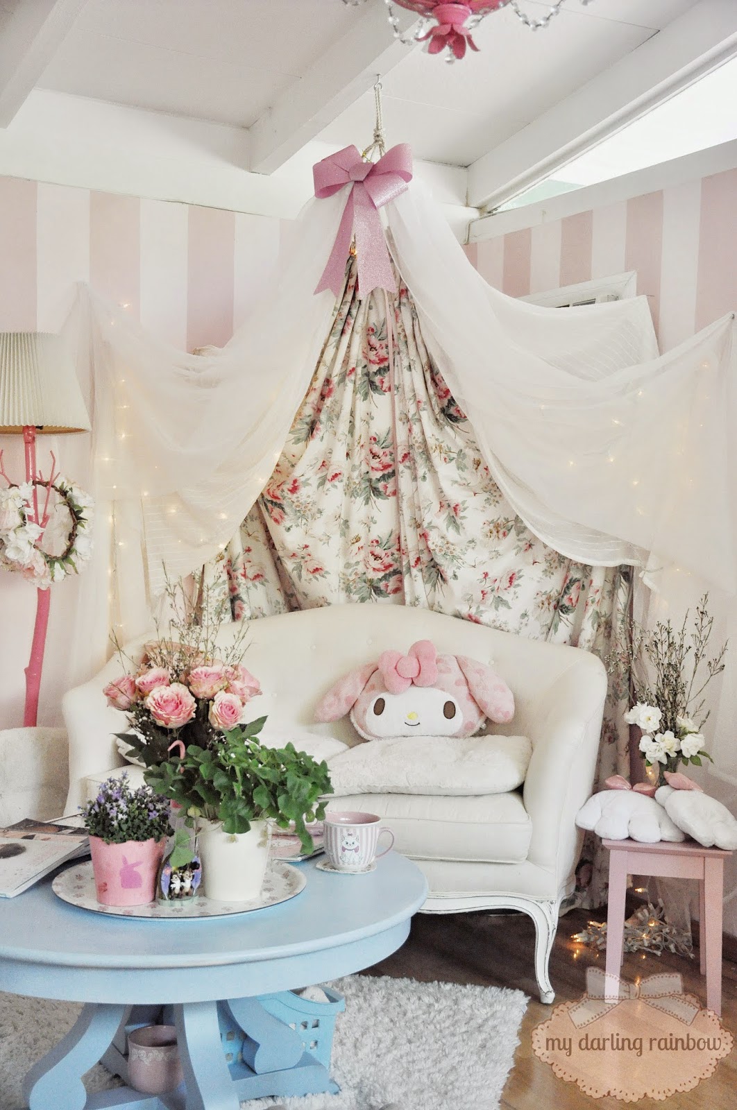
Updated Room Tour~ picture heavy

 I don't feel I took HD quality photos of my new couch and canopy as well as my new bed.
Some new additions to my room are some plants, a shamrock and a.. well, I'm not sure what the little purple guy is, but he has really pretty flowers. I've also been putting fresh bouquets in my room ever week, it really brightens up my place and makes the room smell fantastic.
I've also taken to displaying my Larme magazines because they are just gorgeous to see sprawled out
My couch is from The Bella Cottage and my canopy is ikea curtains threaded though an embroidery loop, one day I'll get around to doing a tutorial on the steps to making one.
 I also have a new shelf in my room from Ikea, cute, simple and affordable.
 I just recently bought some shelf covers at Daiso, so I can easily clean my vanity just by disposing of the cover when it gets gunk on it.
 On top of my shelf, under my vanity I have my Princess artwork that my mum bought me for Christmas displayed, as well as my Cinderella makeup, I felt it was pretty enough to get it's own special placement. To the side are my perfumes, my polaroid and some artwork by Megan Carrigan and Liana He, both are on Etsy if anyone is looking for some cute Disney prints.
My less interesting wall, not pictured is my bathroom but it's a mess and I'm not showing that off ahah. 
A peek into my walk in closet, it's seriously over stuffed and doesn't look cute, so don't expect a full shot down to the end. 
But, here's a peek into my wardrobe. 
 My new bed, it's a four poster, but I removed the end posts because they somehow scare my puppy? So, I just don't want to deal with her being nervous around my bed. I don't remember where I bought the bed, but I had it sent over from the other house because I felt it would fit my bedroom at my current place better.
 I also turned my little desk into a hair station and put all my little knickknacks onto it for easy access.
 My Sony Vaio laptop, phone and earphones~ That all magically fit my room's colour scheme. 
And that's basically it, my updated room tour. I hope my room transforms over time in a more mature and delicate way. So far, looking at how far it's come, I'm extremely satisfied how my tastes have improved.

<3CarisseIris

Gyu-Kaku, Japanese BBQ

For Easter, my mum and I weren't able to get our schedules to match up to catch up, so a few days before we decided to drive out to Gyu-Kaku to try some Japanese BBQ. My mum's coworker highly recommended it to her, so she was really excited. For those who are used to KBBQ, it's pretty similar but the meat quality is a higher grade and the price is a bit steeper.
The menu was awesome actually, there's a lot to pick from and even vegetarian options. If you have a larger group you can order value courses, rather than a la cart items. 
My mum got red wine mixed with lemonade and I ended up with peach champagne with actual peaches in it. 
My mum and I settled for the Gyu-Kaku course, which had a pretty good selection that we both agreed would be tasty. 

Delicious appetizers, I really loved the fried tofu and spicy tuna.
 With the service, they tell you the precise times for each item, and bring them out one at a time so you're not overloaded, which was great. My fave pieces of our courses were the mushrooms and the shabu shabu.

I was also super excited that they took advantage of having an open flame and have smores available for dessert. They even give complimentary hot tea after you are finished.  It was the perfect end to a perfect meal. 

On top of it all, they have an app you can use to scan your receipt and earn points. Just by this meal I'm already earned enough points for a free dessert my next visit.
 They have a good amount of locations around the US [store locations], and I highly recommend it for a satisfyingly delicious meal, that has you leaving with a smile on your face.

<3CarisseIris