How many room tours can one blogger do in the span of 5 years? I guess I'll be pushing that unknown limit, haha! That aside, welcome to my room~
So, at the end of 2015 after a few months of multiple plumbing issues, the main pipe under my house ruptured and water came up and destroyed 2 main rooms of my house including my main bedroom, bathroom, hallway and den. As it ends up, my pipes were over 50 years old and were way past due for updating, so they had to dig up the flooring though half my house to fix it all up. During that time, I had to stay with my mum for over a year and lived in her living room. The construction and everything it entailed took longer than I anticipated, and had to largely work and time itself around my budget. I will have to say now that it is all over, it was highly worth all the stress and definitely turned the page on a new chapter to my life.
Now I've updated you on the main reason behind my hiatus, it's now time to move forward to the more exciting parts and the main room tour!

The first area we'll look at is my bed, since it's the most requested area to speak of and piques the most interest of what I've shown of my room.
So, the bed itself a 'nook' bed, or so it's usually labeled online, the placement is what was previously my walk in closet (pictured above)
So, I measured to make sure my mattress would fit and by some act of fate, it was an exact fit lengthwise, and a good foot of space on the sides! So, I went forward with the plan and hired a contractor to build a custom bed to fit my specifications and help me to plan out what needed to be done and figure out what was possible or not, and to build it in a way that would be removable if need be.
The end result wasn't exactly as I planned out on paper (my original plan handed to my contractor pictured above) but it all worked out into a cohesive and workable design consisting of a comfortably elevated bed sitting on 4 extremely deep shelving units, side storage next to the mattress with 4 electrical plugs for charging a good few devices, and a chandelier with remote controlled dimming above. The main bed base, drawers and all, were fitted to easily side out of the nook and be efficiently disassembled.
Honesty though, the final product was better than anything I could imagine and looks beautiful, it's also cozier than any place I've slept before.
Oh, I should probably touch on a few things, since I do get these questions;
I don't have any air circulation issues inside my closet bed, it also doesn't get hot inside my nook (I actually have the problem of waking up too cold). I don't get claustrophobic inside, I actually love being in enclosed spaces. The only annoying issue overall is putting in my fitted sheets onto my bed really, I may have broken a nail once from it.
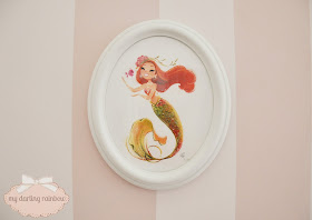
The next part, attached to the nook, was originally intended to be a bench. It was designed to cover the massive patch of what was dug up for access to the water pipe, as I couldn't afford to replace all my flooring or find matching wood, so it was a good way to disguise the area. With input from the contractor, he recommended to add in shelving under the bench, which was a great idea! Later on, while I was in the decorating stage, the bench itself wasn't of use to me so I added on another small storage unit above it and used it as an area to display items, like my Shellie May bears and above it all, an area for my collection of 'Mini Mermies' by Liana Hee
(A closer look at my Mini Mermies)
Turning to the side, my vanity sits against the wall taking in all of the nice bright light. I have two little mounted bunny heads working as hooks for whatever needs quick access~
I also found a way to subtly display my Goofy Movie collection which doesn't fit in with my aesthetic but is one of my pride and joys.
The next little overlooked area is a secret storage inside an inconspicuous ottoman, I also hide all my soft lighting, tripods and other big camera pieces behind the mass of pillows~ It also serves as a great place for selfies!
I also have another Liana Hee piece that my mum gifted me when I finally moved back, she's one of my favorite pieces in my room actually but never gets shown off properly enough on my social media. She's also hooked up in a way that she moves aside and there's another 4 electrical plugs behind her.
The main space of my room as is the usual theme, for me, is a private sitting area. This time around I wanted to incorporate a small television, something to spoil myself with honestly and so I don't need to hang out in my living room if I didn't want to.
The original plan had a bit more decoration to display it, but I was convinced by my contractor that it would overpower my room, and I listened to reason and am glad I did. I included the sketched out plan (above) just to show my way of planning, even if things don't work out I like sketching my plans out, even moreso over a photo of the actual space to help myself visualize.
Also, another gift from my mum were some, apparently antique, shot glasses? But I found them cute and have them out on display under my T.V.
Here is the comfiest couch in the world!
Against the window is my dressing area with my full body mirror and standing wardrobe.
I also found the cutest crate for my pup! It may a bit tall but it was just too gorgeous to pass up!
The main centerpiece of my room is some new lighting that also ties in some cohesive themes to my updated bathroom.
So, I can't remember if I've ever brought up the attached master bathroom in any blog, but it was never something to really show off at least till now~ The original bath was bright green and yellow and before this issue there was no plans to ever update it. So, this was basically my chance to have my dream bathroom. I really wanted something simple and beautiful that would balance my ideal look with a design that wouldn't destroy the property value.
The basis of the layout and design was my overwhelming need for a clawfoot tub, and my preference of wanting marble and adding a little bling. I did actually work with a specialist when I realized I was absolutely clueless and she helped to find a marble design that fits what I wanted. The magic combination was finding a marble company that made a flower design and we were able to change the design to include shining mirror pieces. She really had all the connections and it was a worth it investment!
After that was picked out then came the layout design. Simple, clean and takes advantage of my half window in my bathroom~
Another highlight in my bathroom is my pillowed tiles that look like tufted fabric, I have to add that it has a beautiful pearlescent shimmer finish which absolutely doesn't like to show up in any photos, haha! The features overall were busy enough to not need much additional decor, but what I did pick to be in my bathroom were a few self indulgent pieces. I basically turned my bathroom into my own personal haven; my very own clawfoot tub to bathe in, candles on a candelabra, a pretty chandelier, and lots of shiny bits and bobbles that beautifully reflect candlelight in the evening!
I feel like I should end this blog post and tour with a comparison with how my taste has changed and evolved over the years on my blog.
(how it looked when I first started blogging)
The current~
I hope you enjoyed reading about my room, and going on little virtual tour of it!
<3CarisseIris


